The Minimal Home Accessories challenge is designed to guide students in creating effective HTML/CSS code while adhering to good performance practices. One of the key learning outcomes of this task is understanding how to adapt image breakpoints for a variety of scenarios to enhance performance.
Prepared Images Breakpoints
The challenge places emphasis on preparing images for different breakpoints, a practice that results in significantly improved load times and overall performance. This ensures that regardless of the device’s screen size or resolution, the most suitable image size is selected, preventing unnecessary bandwidth usage and providing a smoother user experisence.
Use the Tag <picture>
The challenge also instructs students in the use of the picture tag. This HTML tag is crucial for responsive web design as it enables the browser to select the most appropriate image from a list of sources based on the characteristics of the user’s device. This means that whether your users are on a smartphone, tablet, or desktop, they will always receive the best-suited image, resulting in quicker load times and a better browsing experience.
<picture class="product__picture">
<source srcset="picture-800.jpg 2x" media="(max-width:450px)" />
<source srcset="picture-1000.jpg 2x" media="(max-width:1000px)" />
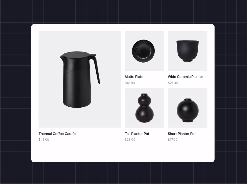
<img src="picture-1500.jpg" alt="Thermal Coffee Carafe" />
</picture>
Use the srcset and media Attributes
Furthermore, students are encouraged to utilize the srcset and media attributes. The srcset attribute allows multiple versions of the same image to be defined, with the browser selecting the most appropriate one based on the device’s screen size. The media attribute, on the other hand, provides media queries that apply CSS styles based on device characteristics, allowing for even more control over how and when certain images are displayed.
<source srcset="picture-800.jpg 2x" media="(max-width:450px)" />
<source srcset="picture-1000.jpg 2x" media="(max-width:1000px)" />
<img src="picture-1500.jpg" alt="Thermal Coffee Carafe" />
Conclusion
The Minimal Home Accessories challenge offers an invaluable opportunity to practice and perfect your HTML/CSS skills. By learning to effectively use image breakpoints, the <picture> tag, and the srcset and media attributes, you will gain a deeper understanding of how to create responsive and efficient web pages. This challenge is an excellent stepping-stone for any aspiring web developer looking to master the art of creating performant, user-friendly web experiences.
Divize.io
Boost your HTML/CSS skills through UI challenges and master front-end development.
Start Challenges!