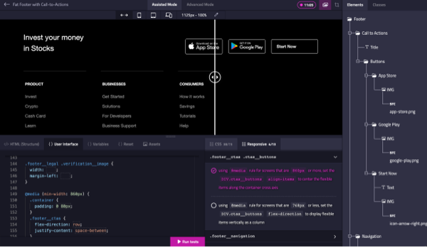
Mastering responsive design is crucial in today’s web development landscape. To help you practice and perfect your responsive HTML/CSS skills, we’ve introduced a responsive controls feature in the Divize editor. This feature enables you to adapt your user interfaces to various device sizes, such as mobile or tablet, in both portrait and landscape orientations. You can also adjust the resolution manually to test your CSS breakpoints.
How Responsive Controls Work
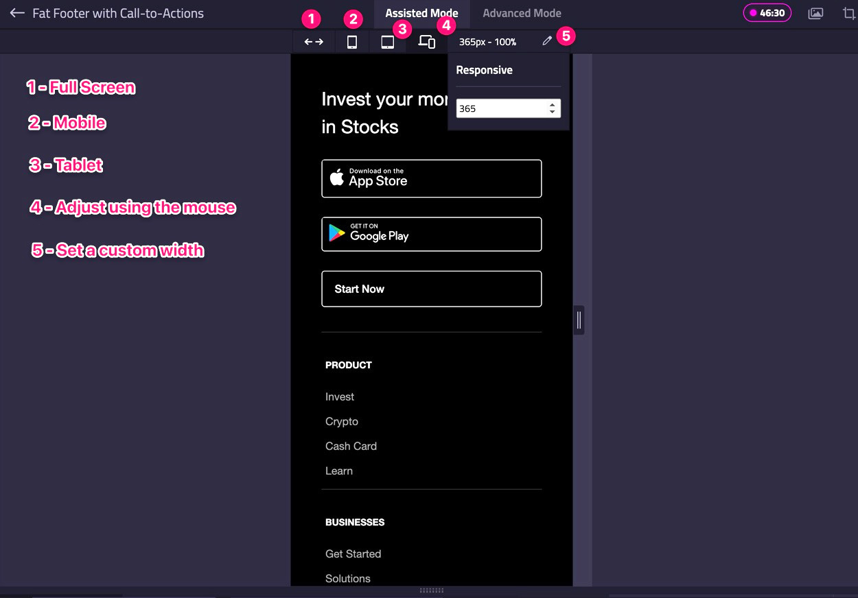
Using the responsive controls is simple and efficient:
-
Click the
mobileortabletbutton in the top bar to adapt the UI to the respective resolution in portrait orientation. -
Click the
mobileortabletbutton again to switch the orientation to landscape. -
Click the
arrowsbutton in the top bar to fit the UI to your browser’s size. -
Click the
pencilbutton to reveal a dropdown where you can set your preferred width manually. -
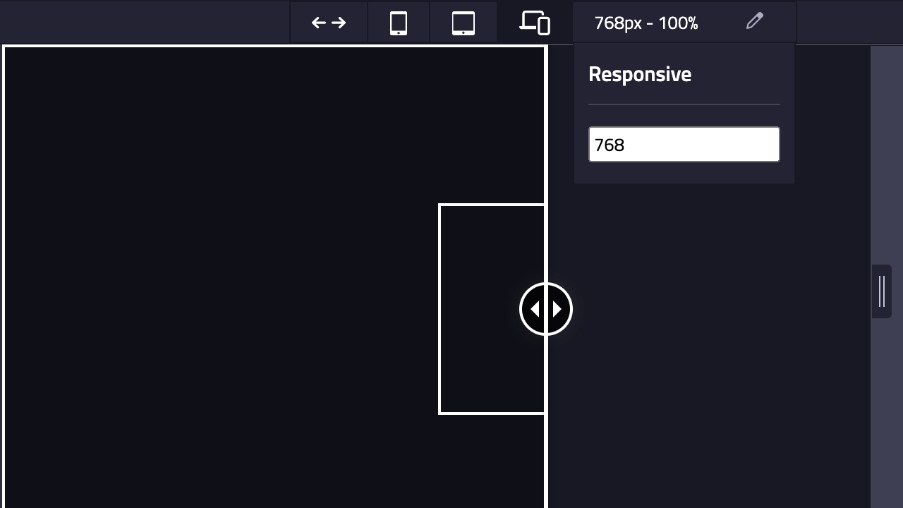
To adjust the
widthmanually, drag the element on the right side of the UI, and it will adapt to the position where you stop dragging.
Conclusion
The responsive controls feature in the HTML/CSS Challenge Divize editor is an invaluable asset for practicing and refining your responsive design skills. By simulating various device scenarios, you can create and test your responsive user interfaces with ease.
Divize.io
Boost your HTML/CSS skills through UI challenges and master front-end development.
Start Challenges!